Improving the user experience of filtering functionality
No one likes an interface that is difficult to use. Sure, there’s going to be a lot of subjectivity behind the idea of the right design, but when the overall consensus is that something isn’t working, we should aim to improve it. After all, the goal of every website should be to help their visitors find what they’re looking for as effectively as possible and anything that stands in the way of that should be scrutinized in an effort to make it better.
Originally, GoBeyond Travel had a sidebar-style design for the filtering functionality on their programs page. I believe the intent here was to approach it in a similar style to an e-commerce site, where you could immediately filter by criteria such as the country visited, what types of activities are focused on, and the trip date range.
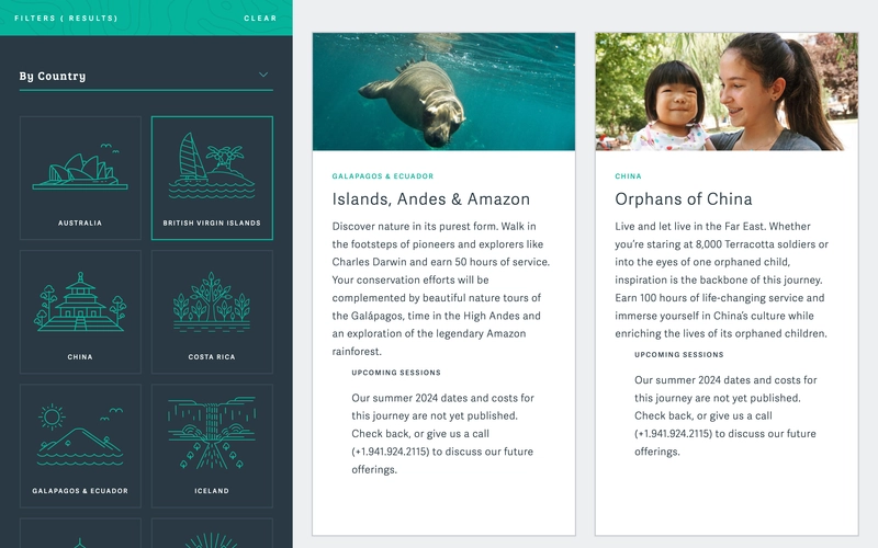
However, as the amount of filterable options grew, the usability of the filtering system began to show cracks. The following items were the most apparent pain points:
- To see all the options available in the filters, you needed to vertically scroll through the list which required the cursor to be hovering over the filter section. While this isn’t the most unusual type of interaction found on websites, it’s also far from being the most intuitive.
- The filters took up a constant third of the page area. This only allowed for two of the program cards to be visible when loading the page, and since the photography used for them is carefully curated, finding a way to focus on that was ideal. Additionally, there has never been such a large amount of programs active at any point where the visitor could be overwhelmed with choices and having the filters immediately visible makes sense.
- When selecting a filter, it didn’t apply itself automatically. You needed to know that you had to scroll to the bottom of the filter list and click on the “Apply Filters” button.
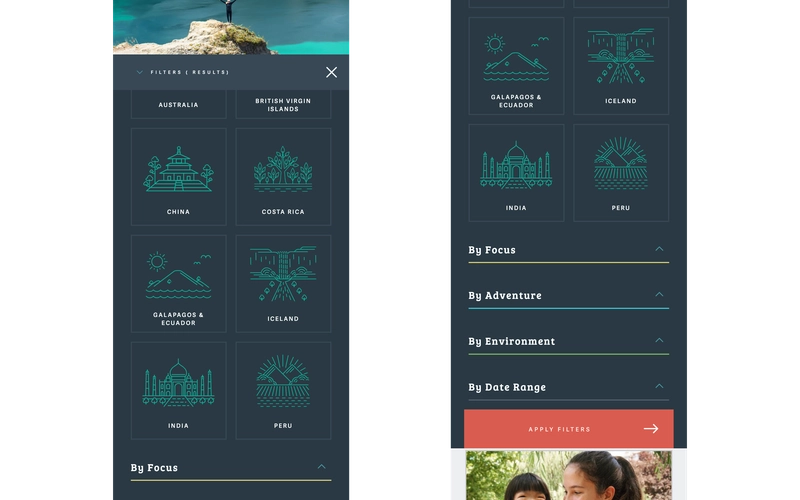
- The mobile experience was difficult to use. Although the filters were hidden by default and accessible behind a button above the program cards area, the filters were added to the page content when activated instead of being shown in a modal dialog. As a result, there was no fixed close button while scrolling and content from outside the filters would become visible as you reached the bottom of them.
The Redesign
Keeping in mind the issues mentioned above, I set out for a redesign of the programs page filtering functionality. It’s not often that I have the opportunity to step into design, but this was one of those instances where I could.
My initial thought was that a horizontal drop-down menu would be the best way to fix the issues with the current functionality. I thought that the color palette, typography, and iconography from the original design worked well, so I made an effort to keep as much of that as possible. After finishing the design mockups, the client agreed with my approach and development started on the new version of the filtering functionality.
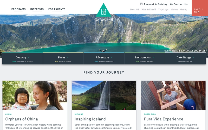
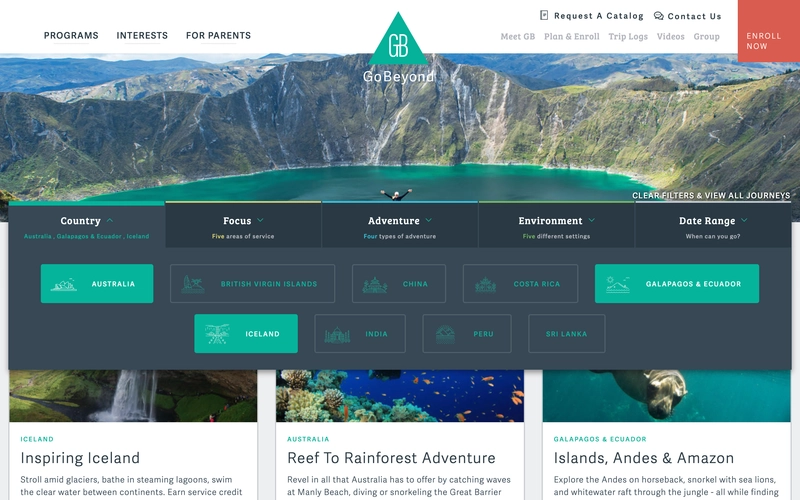
Much better! The filters are now tucked away nicely and easily accessible when needed, appearing when hovering over the corresponding menu item. Additionally, with the reclaimed space in the content area it’s now possible to display three cards per row without them feeling smashed together.
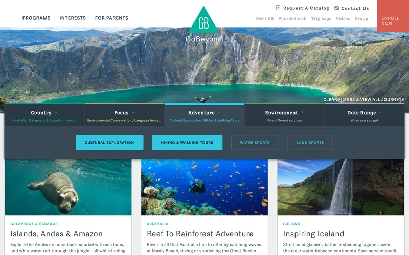
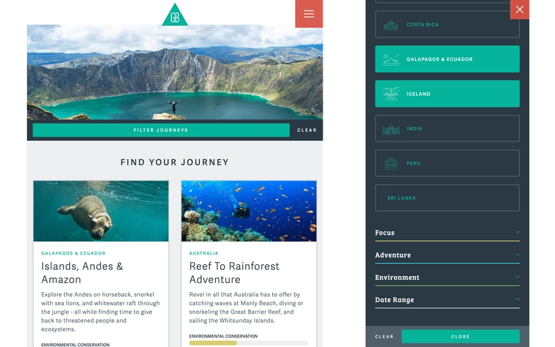
Alright, so the desktop design is far more usable now, but what about mobile? Previously, the vertical filters layout was also used on tablets, which led to both the filters and the content feel like they were fighting each other for space. As part of the updates, the tablet layout was changed so that it functioned the same as the mobile layout, with a clear way to active the filters. Again, this reclaimed space, making it possible to showcase an additional card in the tablet layout.
To overcome the issues with the original mobile filter design, the menu was updated to use a modal approach to prevent content overflow issues and a fixed close button was placed in the upper right corner so that users always have a clear way out of the filters.
But wait, there’s more!
While working on the filtering functionality redesign, it was also decided to give the program cards a slight overhaul. There were two main issues that needed to be resolved:
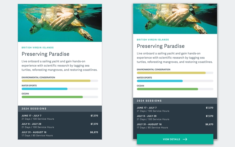
- When selecting a filter from the Focus, Adventure, or Environment categories, a progress bar would be displayed on each card indicating how prominent the selected item was within the program. However, since these bars were only visible after selecting a filter, there was no way for a visitor to quickly digest this information.
- The session dates section of the program cards didn’t have much visual separation from the rest of the content. Both the client and I agreed that it should stand out more to ensure that it wasn’t missed.
To remedy these issues, the top ranking component from the Focus, Adventure, and Environment filter categories was set to display by default on each card, with additional filters being displayed as they are selected. The session dates section was given a contrasting color scheme in line with the overall color scheme of the site to help with visibility.
These changes helped the program cards display more information in a clearer way without seeming too cluttered or overwhelming. Additionally, the hover state of the cards was also updated with a slight layout shift and a “View Details” button appearing at the bottom of the card.
The technical side of the redesign
Over the years, several different developers have worked on this site. Unfortunately, that has also led to several different approaches to development. When I find myself in situations like this, my main goal is to isolate my updates as much as possible.
My approach to JavaScript needed for this functionality was to encapsulate all of my code within its own class and then load and instantiate that class dynamically depending on if it’s needed for the current page. Here’s some pseudo-code to better show what I mean:
// An example of the class encapsulating the filtering logic
class JourneysArchiveTemplate {  constructor(parentEl) {    // the parent element is passed into the instance so that child elements can be accessed, events bound, etc...    this.parentEl = parentEl;    this.menuEl = this.parentEl.querySelector('.filter-menu-selector');
    // initialize some values to store the state    this.activeFilters = {      activities: [],      countries: [],      dateStart: null,      dateEnd: null    };
    // initializing logic and adding events is handled by class methods    this.initHoverEvents();    this.initMobileMenu();
    // etc...  }}
// and in the core JS that is always executed...
const parentEl = document.querySelector('.archive-template-classname');
if (parentEl) { import('./path/to/encapsulating-class.js') .then(({ default: JourneysArchiveTemplate }) => { const journeysArchiveInstance = new JourneysArchiveTemplate(parentEl); }) .catch((err)) => { // handle any errors that occur while dynamically importing the class }}There are different ways of approaching the concept of encapsulation, but this method made the most sense for the project. If the filtering logic had been more complicated or if I anticipated that it would be growing significantly in the future, I would have used React (or more likely Preact in this case since the usage would be rather basic) to simplify managing state within the DOM. If the functionality had a need to be repurposed for use elsewhere on this site or in another project, I would have implemented it as a Web Component.
My approach to styling followed a similar route in terms of isolation. I made of use of the BEM methodology, as I do in most of my work. Since it is only a naming convention and not a framework that requires additional tooling, I’ve found it fits well into projects like this where the rest of the styling doesn’t necessarily follow any strict conventions.
Final thoughts
I enjoyed this project a bit more than some of the other work I do since I was able to focus on the UX and use my (admittedly limited) design skills. A large part of my development philosophy is maintaining an perspective of the user experience, especially that of new users and what their initial impressions could be. It can be difficult to keep that frame of mind fresh, especially when you’ve been immersed in the technical side of a project, but tackling challenges that are focused on UX has always been rewarding for me as it helps to maintain that important user perspective.
Return to work page